Rectifying Safety Concerns
Updates made by the previous homeowner posed serious concerns which had to be addressed prior to any other work. These issues included:
- Load bearing walls which had been removed without the proper replacement support.
- Live wires left dangling dangerously within walls
- Undersized main water line
- Unorthodox HVAC system with wiring, pipes and additional items not up to code
Our design team and contractor worked closely together. They created a plan to make the necessary updates while improving the home’s efficiency and removing future maintenance needs.
We engaged Eren Design to manage a complete gutting / renovation project. Their work was outstanding. Beginning with Kelly on the initial layout and interior design work, we were in sync with the Eren team from the start and had great dialogue on the changes we hoped to make.
Terry managed the project and did a terrific job of supervising the various subcontractors and Terry’s detailed carpentry work was masterful. All the Eren employees were great to work with as were the contractors hired.
We plan to keep those high quality contractors on our list for any future maintenance issues. Our weekly project updates with Janice, by phone or on site, helped keep the project moving, kept us informed and allowed for rapid decision making. We would highly recommend Eren Design.
P. Coleman
Floor Plan Updates to Create an Open Kitchen and Maximize Views
The home’s original floor plan featured a bizarre layout. There were partially shared bathrooms and bedrooms with virtually no closet space. Odd corners with practically unusable square footage were scattered throughout. And, the kitchen was completely closed off from the rest of the home.
This was nothing like the open floor plan the Colemans wanted to create that took advantage of the stunning hillside views.
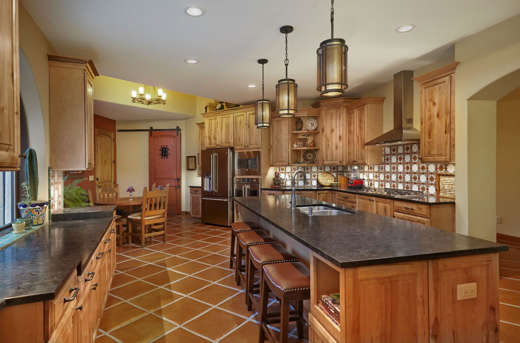
By opening up the kitchen to the rest of the home, we were able to create a space that made cooking a joy and entertaining a breeze. This also eliminated some of the existing cabinetry. To help maximize space, we utilized custom cabinet design features to make storage easier.
Custom Cabinetry Maximized Space
Because opening the kitchen to the rest of the home eliminated some of the cabinetry, we utilized custom cabinet features to make storage easier and maximize space.
We created an indoor/outdoor entertaining space. During the process of updating the layout, we even uncovered an existing arched window that had been covered in stucco during a previous remodel. We took advantage of this stunning feature by installing an energy efficient window.
The sink was relocated to take in the view. A new gas line was added for the new cooktop. Our designer also helped the clients pick stunning maple cabinets, Mexican tiles for a backsplash with character, and leather-finished granite countertops.
Developing a Luxurious Master Suite
The previous homeowner’s master suite updates left significant room for improvement. The bathroom featured a tiny shower stall; massive jetted tub that dominated the room; and closet that opened to the bathroom, which resembling a storage locker.
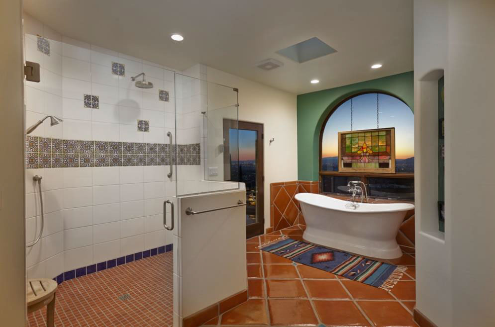
Reimagining the entire space, we added a window. This captured the night time city views which were previously nonexistent. A freestanding cast iron tub was installed in front of the window, offering a luxurious location for a soak.
A spacious, zero clearance shower designed for two was installed. It was outfitted with grab bars, a hand shower, and additional accessibility features to ensure the Colemans could enjoy it for years to come.
Additionally, a dedicated walk-in closet was added. It was outfitted with custom built-in storage to accommodate the Coleman’s wardrobe needs.
Designing 3 Separate Guest Suites for Visitors
The Colemans wanted their home in the Tucson foothills to be a destination friends and family would enjoy staying. The original guest quarters included partially shared bathrooms and odd guest bedrooms.
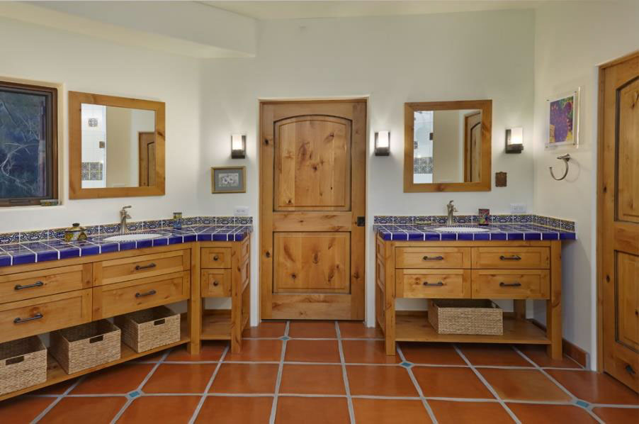
Creating three separate suites for visiting guests was the final major update we made. A single jack-and-jill bath was separated into two guest bathrooms. A third guest bedroom suite was carved from part of the former master bath. Each bathroom was given its own unique color theme. However, the use of painted sinks and Mexican tiled shower surrounds kept the hacienda feel consistent.
Making the Home Low-Maintenance, Energy Efficient & Beautiful
To maximize energy efficiency, we replaced all the windows and exterior doors. This also allowed us to maximize the size of the doors, enhancing the home’s connection to the outdoors.
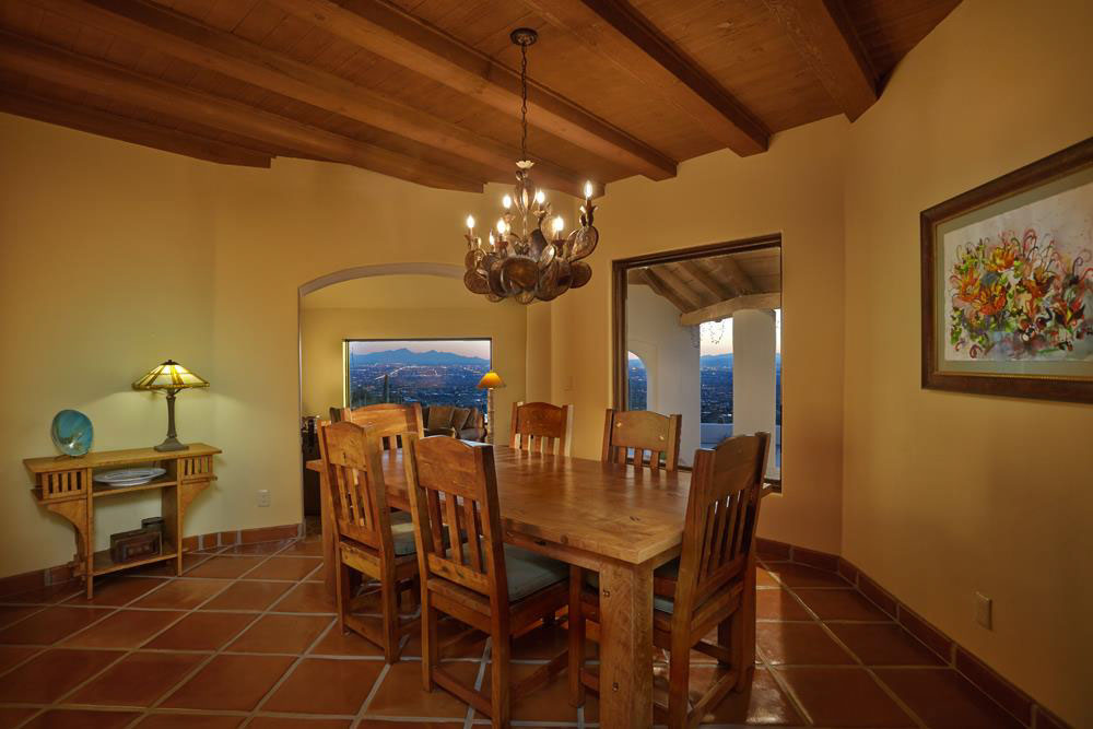
Existing wood planks and ceiling beams were uncovered during the remodel. We restored these to their original beauty, helping the home maintain its sense of history.
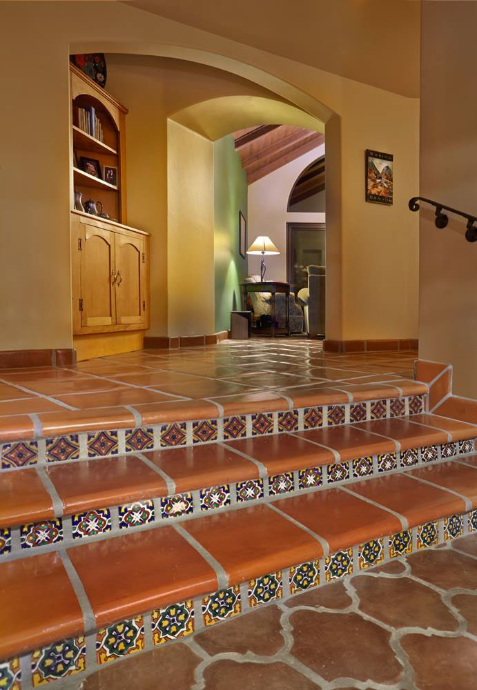
To improve the transition between rooms, we added arched openings. An ill-placed skylight was reconsidered to further improve the transition between rooms. Tecate Saltillo floors were installed throughout the home to give it a consistent theme. A new wine bar was added to enhance entertaining. And, a new front door and covered entry were designed to help greet visitors with warmth.
Coleman Before/After
Our designers aren’t limited to a home’s existing floor plan. They have the knowledge and experience to completely reimagine a space to help you reveal the full potential of your home. In this whole home remodel, we removed walls to create an open floor plan and reworked bathroom space to create a private bathing experience for the guests.
Our work also helped uncover previously hidden windows, refinish exposed beams, and reposition skylights to maximize daylight.


